

Been awhile! I hope you’re ready for some rambling and a lengthy painting video. This new demo is an acrylic painting, a 24x20 on canvas. In this segment you’ll basically see a real time (no cutting of clips) illustration of my process in the studio, typically how I proceed on larger paintings. While this one is not a “big” painting per se, it’s about as big as I can figure out how to record, and still give you all a view that allows you to actually see what I’m doing.
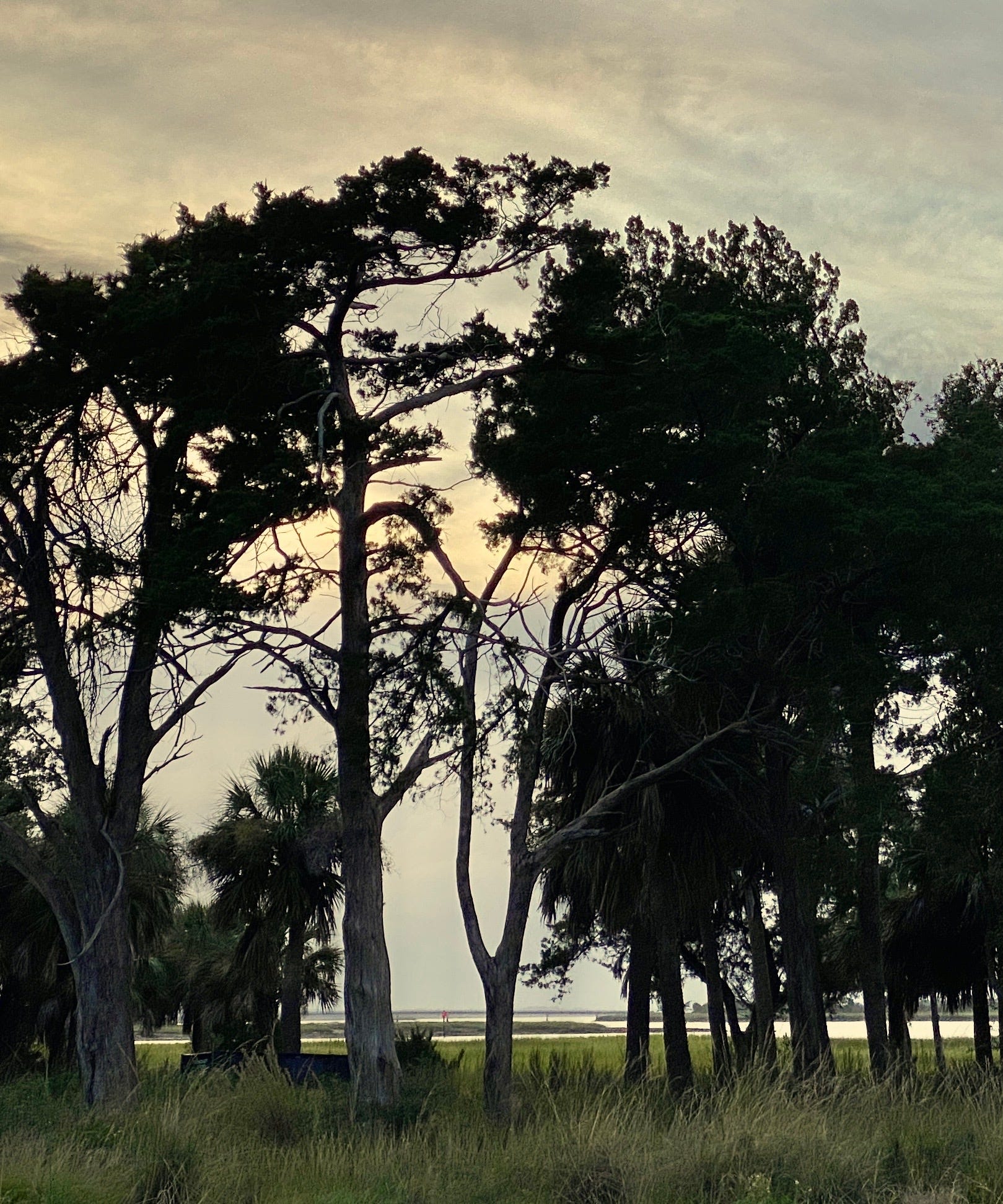
As I mention in the video, and my apologies if I start talking about something and get so sidetracked that I never return to the beginning, this is a subject that I have both painted from life, and attempted to paint in the studio. My field studies were more successful, but not painted in the same situation. I’m drawn to the more somber/emotive idea that this reference presents, and have tried a number of paintings of it in the studio. Some have had a kernel or two of interest, but I still haven’t done justice to what I truly feel about the scene. So you get to watch me try again, I’m sorry. Like I said in this video, if it doesn’t work out, you get to see how I prime over a painting to start anew!
So here we go… This is basically the block in video. I’ll probably send another one out it two to three weeks because there will be a number of these to send to you before the painting is done. I don’t want to crowd you, but also don’t want to lose you. If we were in an in person class, this is what we’d do, so why not?
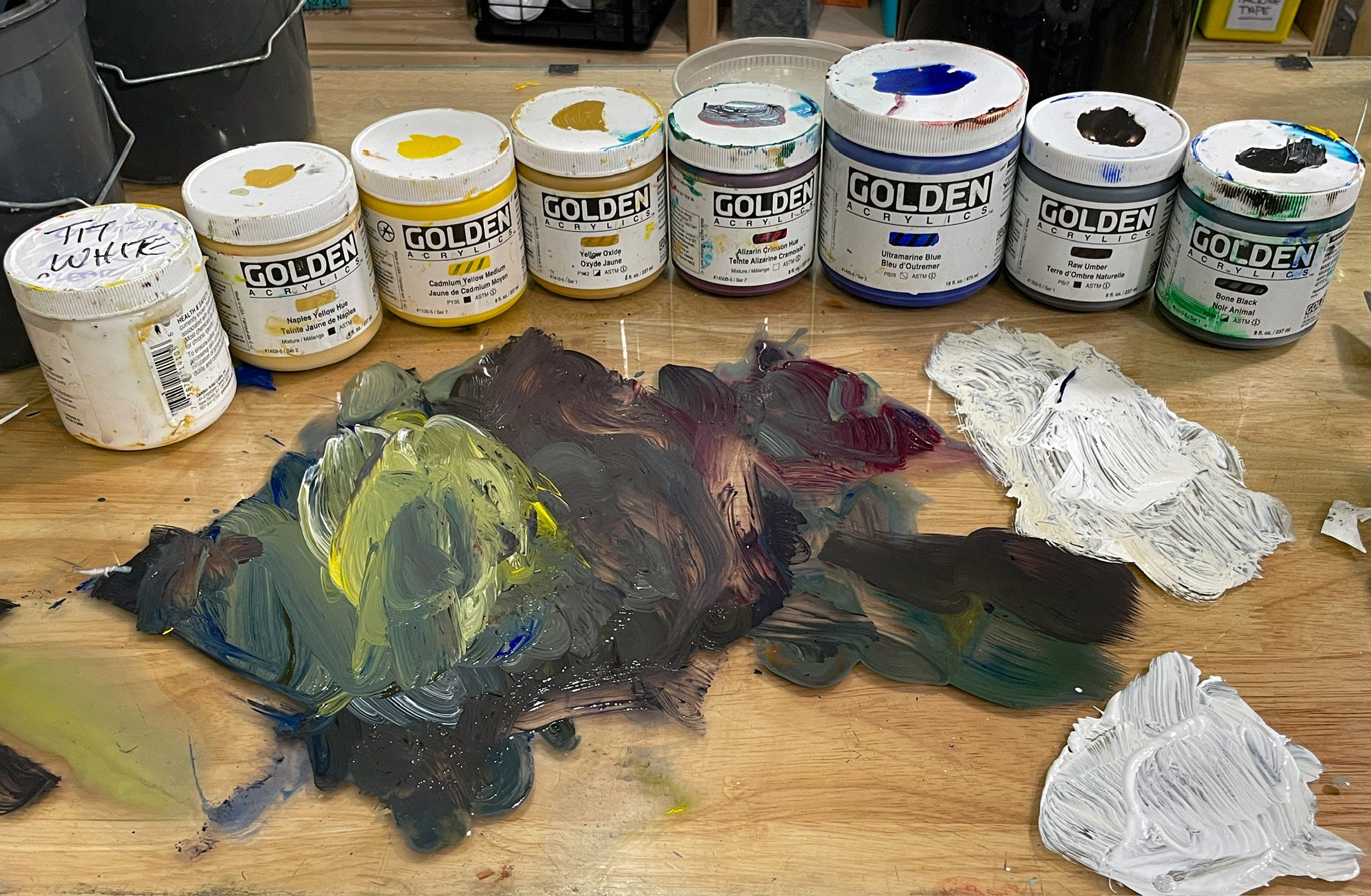
The palette for this painting is: Titanium White, Naples Yellow Hue, Cadmium Yellow Medium, Yellow Oxide, Alizarin Crimson Hue, Ultramarine Blue, Raw Umber and Bone Black. No medium, yet. It’s a pretty subdued palette for a pretty subdued subject. I chose colors that I know will give me the right value range and harmony, that the painting needs. As the painting develops, if I feel like it’s too restricted and needs an additional color or two, I wont’ hesitate to add them to the palette.
Big for me is this idea of a primer that works better. I’ve always been after a good surface, and have obsessively pursued that idea for at least the last 40 years of my painting life! Supplies are not the end all, and we could all be artists with ground up rocks and a reed to blow pigment onto a rock wall. But this is the 21st Century, so I’m working on developing a formula, using a high quality acrylic primer (Lascaux Primer, Michael Harding Primer so far), mixed in a ratio of 1:1 with Golden Matte Medium. I emailed the support team at Golden Paints about this and received a reply approving this, stating that if I’m painting with acrylics over this ground, adhesion will be fine and the results lasting and archival. They did indicate that it would not be a good ground for oil painting.
I am doing this because while experimenting with a high quality, retail store, 100% acrylic wall primer, I discovered that it was as good a surface to paint on as I’ve found! But the question of using non sanctioned materials in fine art still hangs over our heads. I’ve been digging into this, researching and asking questions of those who know. But so far, no definitive answer as to it being a sound idea to use it. I’ll keep you posted when I know more. I rely a lot on Michael Skalka who publishes The Syntax of Color, a place to learn about artist supplies and process. He was the Conservation Administrator for the National Gallery of Art, and is now the Chairman of the subcommittee of the American Society of Testing and Materials (ASTM) D01.57, Artists' Materials, past and current author of "Ask the Expert" for The Artist's Magazine, past author of "Artist's Q&A" for American Artist Magazine. If I will find out the right answer, he’s the guy who will know. He’s looking into this subject and discussing it in his newsletter now.
Brushes are Princeton ‘Dakota’ 6300 series, only ones used at this stage. I use these because they’re stiff enough to give me good control of a good amount of paint, and they hold their shape very well. Holding them so that the brush is more or less parallel to the surface of the canvas, I’m able to block in some nice shapes and lay on a good amount of paint. Sometimes they hold their shape so well that they’re a little to predictable, they don’t give many ‘happy accident’ strokes. When I need that sort of stroke, I will go with a regular old hog bristle brush.
My reference…
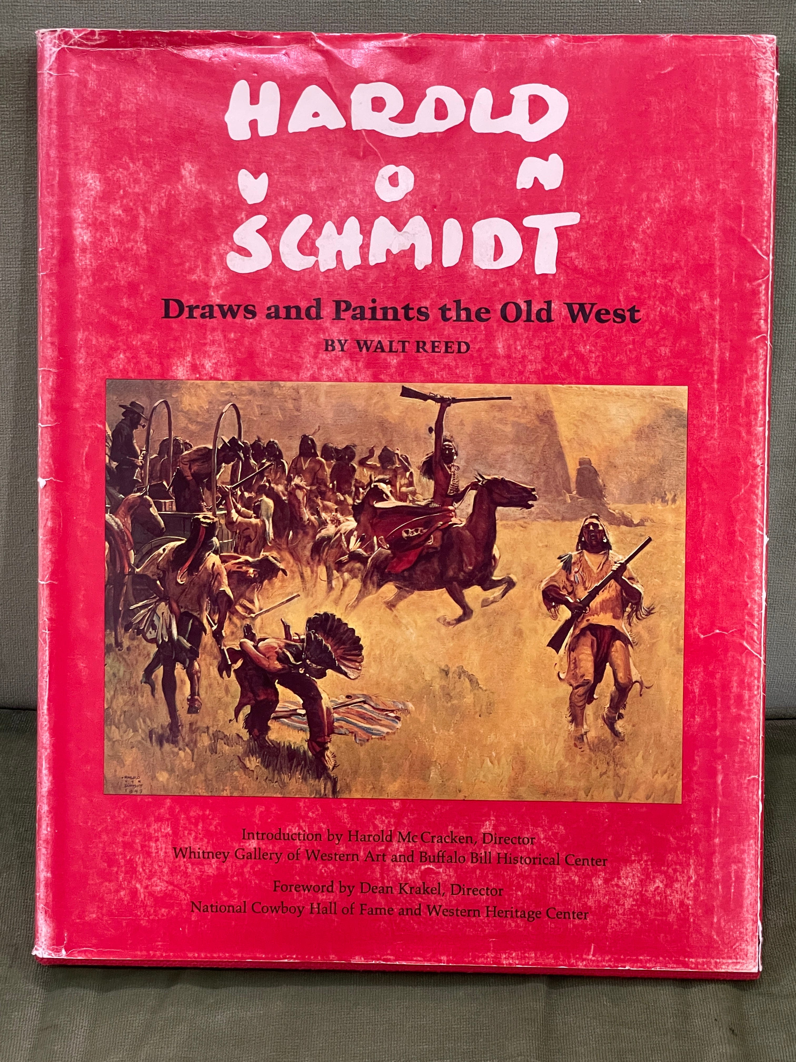
This month’s book is an old one from my days in art school. Maybe one of the first “expensive” books I bought, giving up the Kraft Macaroni and Cheese and chicken livers for a couple of weeks, to own. If you can find one, it’s full of good artistic foundation and interest about a time when artists were mostly illustrators, if they were making a living at being an artist.
Harold von Schmidt, Draws and Paints the Old West, (May 19, 1893 – June 3, 1982). Von Schmidt began his art studies at the California School of Arts and Crafts while he was still in high school. In 1924, he entered the Grand Central School of Art in New York City. He moved to the suburban community of New Rochelle which was a well-known artist colony and home to many of the top commercial illustrators of the day such as Frank and J. C. Leyendecker and Norman Rockwell.[2] Also in residence were Al Parker, Mead Schaeffer and Dean Cornwell, who, along with Tom Lovell and N. C. Wyeth would become leaders in the field.
Thank you for sticking with me and continuing to support my efforts here on Substack and Crayolas Set Me Free. Please spread the word to anyone who you think would be interested.
Keep your brushes wet!
Cheers,
Marc

Share this post